The Analytics Dashboard
The Analytics page in your dashboard shows a comprehensive view of your booking activity, revenue, and client patterns. Access it from your dashboard sidebar under Analytics.
The page has two tabs. Analytics is the numbers below. Activity is the log behind them — every booking change, message, webhook, configuration change, and platform action, with who did it and whether it arrived.
Key Metrics
The Analytics page displays several key metrics to help you understand your training business:
- Total bookings: Count of all bookings in your system, regardless of status.
- Booking status breakdown: See how many bookings are pending, accepted, rejected, or cancelled. This helps you spot confirmation rates and cancellation patterns among your clients.
- Total revenue: Sum of all payments received (paid bookings only). Revenue is shown in your business's default currency.
- Per-coach performance: A breakdown showing which of your coaches are most popular — for example, whether 1-on-1 sessions or your small-group class fills up fastest. Coaches are sorted by booking count, so you can instantly see your top performers.
Peak Booking Times
The Analytics dashboard shows two peak-time insights:
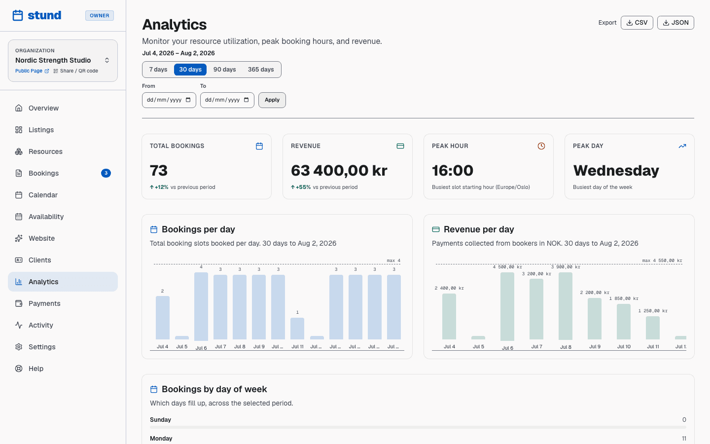
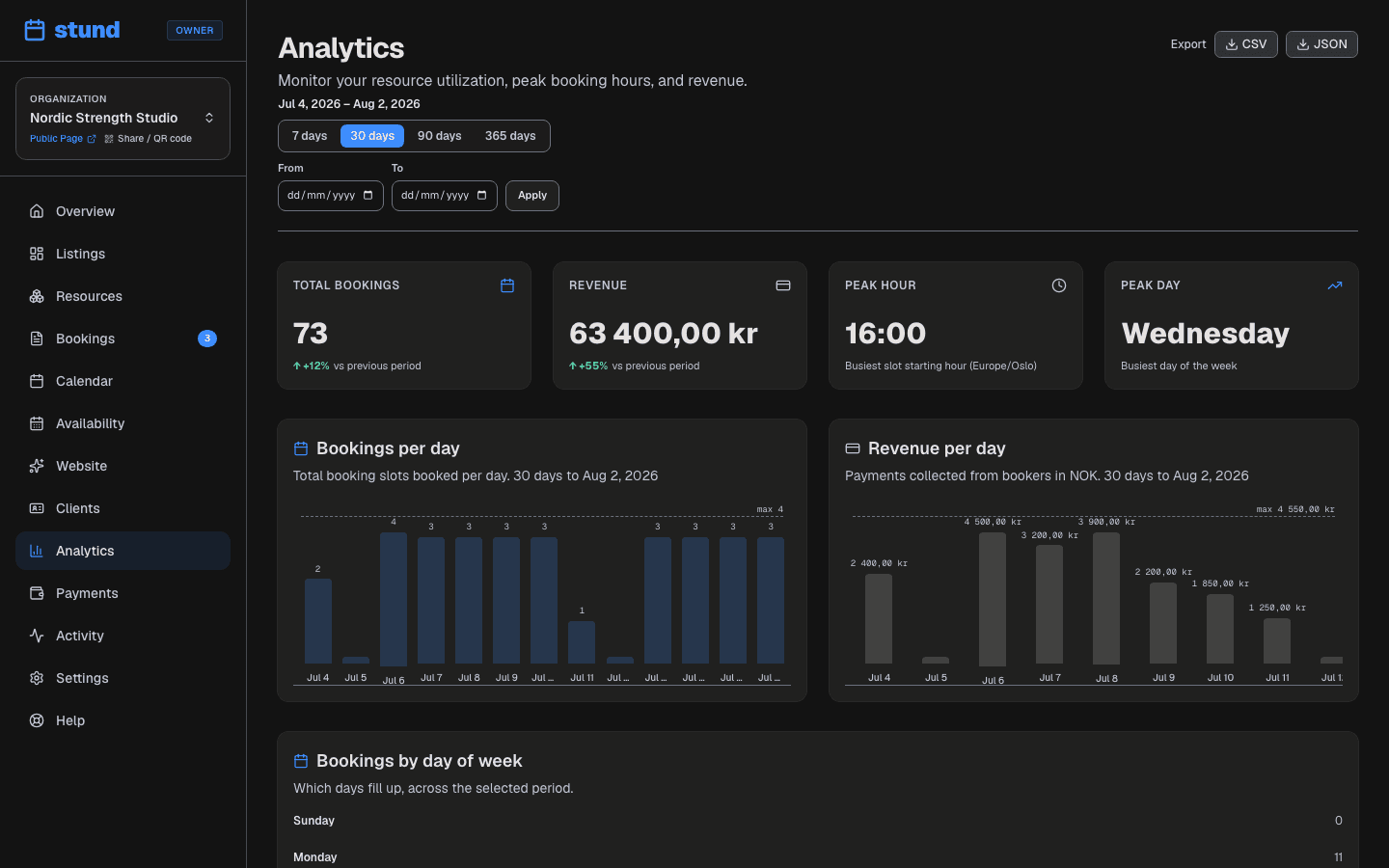
- Peak hour: The hour of the day (in your timezone) when the most booked sessions start. If your peak is 18:00, that is the hour your floor is busiest.
- Peak day of week: The weekday that holds the most booked sessions (Monday through Sunday). A pattern like "Tuesday evenings are always full" tells you where your capacity is under pressure.
These patterns help you plan ahead — if Tuesday at 18:00 is always full, that is where a second slot, a group session, or a higher price is worth trying, and the quiet hours are where a discount can pull demand across.
Good to know
These are session times, not order times — the hour a session runs, not the hour a client sat down to book it.
Open more hours around your peak straight from your coach profiles under Coaches.
Choosing a reporting period
Above the figures are period buttons: 7 days, 30 days, 90 days and 365 days. Everything on the page — the totals, the charts, the peak times — describes the period you pick, and the period is part of the page's address, so you can bookmark a view or send it to your accountant.
Under the totals you'll see how the period compares with the one immediately before it: "↑ +30% vs previous period". If the previous period had no bookings at all, it says so rather than showing a meaningless percentage.
Bookings by day of week
A card shows how bookings spread across the week, with your busiest day highlighted. Combined with the hourly distribution below it, this is what tells you whether to open earlier on Saturdays or add a Tuesday evening class.
Day-by-day trend
Two charts break the period down into one bar per day:
- Bookings per day: how many bookings start on each day.
- Revenue per day: what was collected on each day.
Each chart names the span it is showing under its title — "30 days to 5 April", say. For long periods the charts show the most recent 30 days rather than a year of unreadably thin bars; the totals and the comparison above them still cover the whole period you picked. If the bars need more room than the card has, the chart scrolls sideways.
If nothing happened in the period, the chart says so instead of drawing an empty axis. A day with zero bookings inside a busy period still gets its place on the axis, so gaps are visible.
Hourly Distribution
The Hourly chart shows how bookings are distributed throughout the day (in your timezone). All twenty-four hours get a column — useful if you coach late into the evening or open before dawn — so you can see:
- When clients typically browse and book — often lunch breaks and evenings for working clients.
- Whether there are quiet hours you can use for programming, admin, or marketing.
- Which time slots are consistently overbooked, signaling that you may need to open more availability or add another group session at that time.
Using Analytics to Optimize
Here are practical ways to use your analytics as a trainer:
- Manage capacity: If a specific session type is heavily booked, consider adding another one or opening more availability for it.
- Plan your week: Use your peak-time data to decide when to offer sessions — and when to block time for programming, admin, or your own training.
- Spot no-shows: Monitor booking status. High cancellations or rejections might indicate no-show patterns — you could ask for confirmations or take deposits.
- Test pricing: Track whether lowering prices on off-peak times brings more bookings to fill quiet slots — a midday discount can fill the hours between morning and evening rushes.
- Marketing: If certain session types are less popular, invest marketing effort into promoting them.
Exporting Your Data
You can export your analytics as:
- CSV: A spreadsheet-friendly format you can open in Excel or Google Sheets. Includes summary metrics, per-coach breakdown, hourly distribution, and the day-by-day figures, with the dates they cover.
- JSON: A machine-readable format for integration with other tools or custom dashboards.
Both exports are available via the Export buttons at the top of the Analytics page. An export covers exactly the reporting period on screen, so the numbers in the file match the numbers you were looking at when you downloaded it. Change the period first if you want a different window.
Timezone Considerations
All times and charts in Analytics are computed in your business's timezone (set in Settings → Company information). This means:
- Peak hours are reported in your local time, not UTC.
- Hourly and day-of-week distributions reflect your timezone's daylight-saving transitions.
- Daily breakdown aligns with your local midnight, not global midnight.
If you change your timezone, future analytics will use the new zone, but past data remains in its original timezone.
What Counts as Revenue
Revenue in Analytics includes only:
- Bookings that have actually been paid for a positive amount.
- Payments received via Mollie (card, VippsComing soon or Klarna).
- Actual client payments, not internal transfers or adjustments.
Pending, rejected, or cancelled bookings do not contribute to revenue, even if a payment was initially collected (cancelled payments are reversed by your payment provider).
Good to know
Sessions you are paid for in cash on site are not counted here — Analytics revenue tracks online payments only. Payments has the transaction-level detail.
Activity Log Tab
The Activity tab provides a real-time audit trail of events happening within your business account. Owners and administrators can inspect this log to answer "who changed what?" or "why did a delivery fail?".
Source Categories
You can filter activity events by source category:
- Bookings: Status changes (e.g., requested, confirmed, cancelled, rescheduled) and approval actions.
- Notifications: Automated and manual emails or SMS sent to clients and coaches, including delivery outcome (sent, failed, or skipped).
- Configuration: Changes to your business settings, pricing, resources, or services made by team members.
- Webhooks: Deliveries sent to your custom HTTP endpoints, showing success, retry, or failure status.
- Domain events: Custom domain registration, renewal, and DNS configuration events.
- Platform actions: Administrative actions on your account, such as plan upgrades or suspension updates.
Filters and Troubleshooting
- Time Windows: View activity over the last 24 hours (1 day), 7 days, or 30 days.
- Only Problems Toggle: Instantly isolate failed notifications, failing webhooks, or error events with the Only problems button.
- Direct Booking Links: Events linked to a specific booking feature an Open booking link to jump directly into the booking inbox for further action.
Limitations
- Analytics only show bookings in your current business. If you run multiple businesses on Stund, each has its own separate analytics.
- Historical data begins when your business was created on Stund. There is no backfill for periods before you joined.
- Analytics refresh near real-time, but may lag by a few minutes as data syncs.
- A very wide period on a very busy business may hit an internal limit. If that happens the page says so, and the figures shown are a lower bound — pick a shorter period for exact numbers.
Exports follow the period
The CSV and JSON buttons export the period you have selected, not all time. The file records which period it covers, so a download from three months ago is still readable. It also includes the day-of-week breakdown and the previous-period comparison.